Aggregator: A Social Media Hub

This was a social media app group project meant to aggregate different feeds, aptly named Aggregator. The fundamental aspect was to have one way to view Twitter, Instagram and Facebook content.

There were two tasks that the user had to be able to accomplish: filtering their feed so that only Twitter appeared and retweeting a tweet. The approach that my group took was to have the filtering ability up front and accessible as opposed to a user preference feature.

One UI lesson I learned from working on this project was how much people have gotten use to the conventions on the sites they currently use. Originally the plan was for every post, regardless of network, to have an action tab that would have all the actions (like, retweet, reply, etc). This unifying element proved to be divisive among the users that tested the paper prototypes. Users preferred to have the familiar layout for each social network’s post.

Who Wants to Play?

This project involved the creation of a social media app for collaborative event creation. The idea would be for one person to create an event defined by an activity, and then invite friends who would then vote on where to have the event. I chose to focus on playing games as an activity, with the poll being dedicated to finding a venue. One feature that I decided to implement in order to take some of the workload off the event organizer was to implement some logic to the friend selection process. Using a combination of a list created by the user and content from social media (Facebook for now), the app would find people most likely to participate in a given activity based on factors such as event attendance and stated interests. These friends would appear at the top of the invite lists as people who would most enjoy a particular game.

Responsive Web Design Portfolio

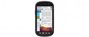
As a demonstration of responsive design skills such as utilization of media queries, I began development of a new portfolio site for my web work that would adjust itself to multiple platforms. The goal was to have an experience for mobile, tablet, and desktop that was optimized for each. Ideally, this would mean using the same assets in multiple views.

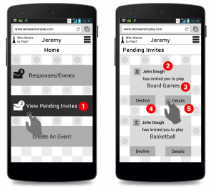
In designing the landing page, I decided on an above the fold approach that dispensed with biographical information in favor of quickly getting people to content. I did not want to lump all the content together, nor did I want to incorporate sorting based on categories or tags right away during development. Instead I sorted all of my content into three subjects: design, development, and tech. Design would be for wire frames and other graphics work in web, development would focus more on coding and having links to Github content, and tech would be for physical prototypes like Arduino and Leap motion.

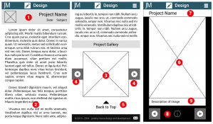
In terms of content presentation, I decided to separate annotations and descriptions from graphic content. For most of my wireframes I adopted a standardized presentation style with annotations on the right hand side. Instead of having these annotations as part of the image, I decided to store them in the database instead and retrieve them using AJAX. AJAX was used in combination with an image browser to reduce the amount of content that needed to be loaded upfront. Some of my wireframe series are quite lengthy and detailed, requiring a lengthy load process. The only image resources that are loaded upfront are the thumbnails. Even with 69 thumbnails, total data transferred would be less than 3 MB initially. The overall goal was a display framework that was desktop and mobile friendly in terms of load time and data, respectively. Displaying thumbnails first instead of full size images dispensed with the constraints over image size on load time since the only full size images that would be loaded would be ones the user clicked on for a full view.

Hackernest Construct 2014

Already having done some experiments with the Leap motion tracker ( Leap Finger Cube ) and nodeJS, I joined a team of my fellow students from Sheridan College to do a multiplayer version of Rock, Paper, Scissors using hand gestures. We did this project as part of the Hackernest Toronto Construct hackathon at the Ryerson Digital Media Zone located in Dundas Square. The goal was to have some kind of functioning prototype that involved mind and/or motion.

The greatest challenge was multiplayer communication, and learning how to properly send data between computers on the same network. Using multiuser shared chat as a basis, we transformed this system into sending the Leap motion results and then comparing to determine a victor. Our previous hard coded web pages used for Leap testing were converted to the Jade templating system for Node, and this interface displayed each player’s gestures as they made them and then showed the comparison.

Below is a demo from Hackernest showing how the game works. Right now the client side is in charge of game timing, so both players have to start at roughly the same time. The goal in the future would be to have the nodeJS server control the timing of the game so players could choose their identity and start as soon as there is a minimum number of participants.

Your Number is Up

Continuing my theme of concentration and mental training games I decided for my first app developed exclusively for a mobile platform I would do a number pattern matching game. The idea was to start with basic patterns and work towards more complex actions that would use actions only possible on a mobile device. The game begins with simple tap and swipe gestures, but later requires two fingers to do actions simultaneously. Eventually I would hope to create a sort of finger twister where all five fingers would be required to perform an action, and each finger would have to hit the screen in a specific sequence.

Screen captures of BurriTO app

BurriTO

This was a quick 8-6-4-2 wire framing exercise for a burrito ordering application. I found the 8-6-4-2 prototyping system to be a good way to quickly sketch and get an idea for the user flow of an app by allowing someone to see so many screens at one time in their sketch. The focus of dividing the paper up into chunks really helped with keeping the limitations and challenges of small screen size in mind while doing wireframes.

Some of the usability goals that I had in mind while doing my wireframes involved touch manipulation and information density. I decided on making buttons as large as possible, so I stretched all buttons to full width and thumb height (100 pixels for most) at 320 x 640 resolution, so that it would be a comfortable UI for mobile. While doing some user experience testing with actual images on a mobile device, I found that using the app with a thumb and one hand was well within the realm of possibility. Far too often too much information is crammed onto the mobile screen. I decided that instead of cramming I would present as few options as possible onto each screen and take advantage of the slide outs and other navigation options on mobile to keep users oriented. I also learned to use scrolling to full advantage in order to keep the user on a page while presenting more options. The biggest part of the ordering process, toppings, was kept on one “screen” with expanding menus that could be collapsed after options were selected.

BurriTO: the best way to get TO your next savoury meal!