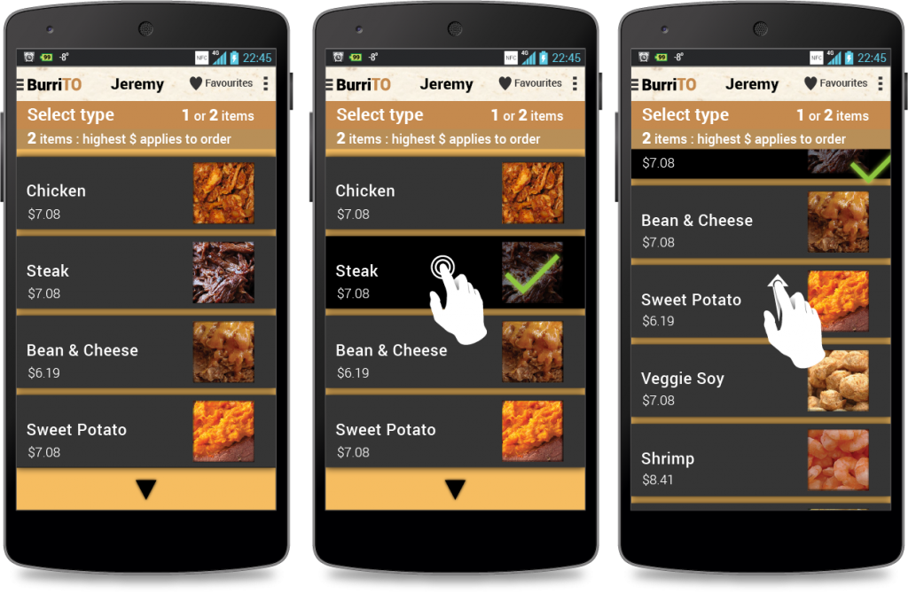
This was a quick 8-6-4-2 wire framing exercise for a burrito ordering application. I found the 8-6-4-2 prototyping system to be a good way to quickly sketch and get an idea for the user flow of an app by allowing someone to see so many screens at one time in their sketch. The focus of dividing the paper up into chunks really helped with keeping the limitations and challenges of small screen size in mind while doing wireframes.
Some of the usability goals that I had in mind while doing my wireframes involved touch manipulation and information density. I decided on making buttons as large as possible, so I stretched all buttons to full width and thumb height (100 pixels for most) at 320 x 640 resolution, so that it would be a comfortable UI for mobile. While doing some user experience testing with actual images on a mobile device, I found that using the app with a thumb and one hand was well within the realm of possibility. Far too often too much information is crammed onto the mobile screen. I decided that instead of cramming I would present as few options as possible onto each screen and take advantage of the slide outs and other navigation options on mobile to keep users oriented. I also learned to use scrolling to full advantage in order to keep the user on a page while presenting more options. The biggest part of the ordering process, toppings, was kept on one “screen” with expanding menus that could be collapsed after options were selected.
BurriTO: the best way to get TO your next savoury meal!


