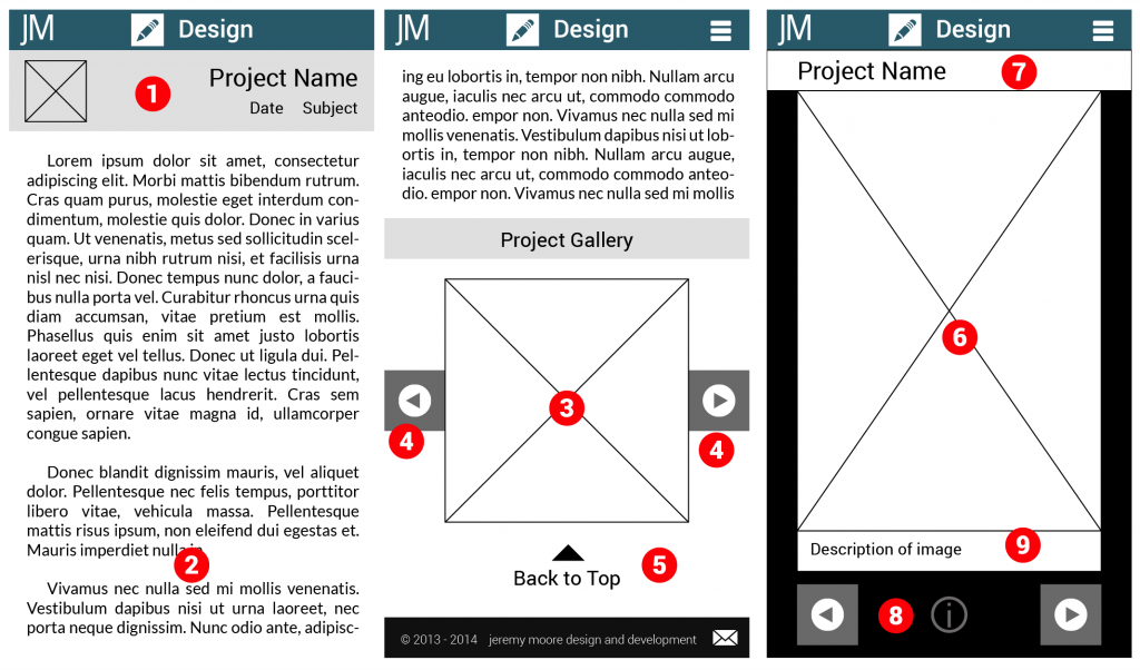
As a demonstration of responsive design skills such as utilization of media queries, I began development of a new portfolio site for my web work that would adjust itself to multiple platforms. The goal was to have an experience for mobile, tablet, and desktop that was optimized for each. Ideally, this would mean using the same assets in multiple views.
In designing the landing page, I decided on an above the fold approach that dispensed with biographical information in favor of quickly getting people to content. I did not want to lump all the content together, nor did I want to incorporate sorting based on categories or tags right away during development. Instead I sorted all of my content into three subjects: design, development, and tech. Design would be for wire frames and other graphics work in web, development would focus more on coding and having links to Github content, and tech would be for physical prototypes like Arduino and Leap motion.
In terms of content presentation, I decided to separate annotations and descriptions from graphic content. For most of my wireframes I adopted a standardized presentation style with annotations on the right hand side. Instead of having these annotations as part of the image, I decided to store them in the database instead and retrieve them using AJAX. AJAX was used in combination with an image browser to reduce the amount of content that needed to be loaded upfront. Some of my wireframe series are quite lengthy and detailed, requiring a lengthy load process. The only image resources that are loaded upfront are the thumbnails. Even with 69 thumbnails, total data transferred would be less than 3 MB initially. The overall goal was a display framework that was desktop and mobile friendly in terms of load time and data, respectively. Displaying thumbnails first instead of full size images dispensed with the constraints over image size on load time since the only full size images that would be loaded would be ones the user clicked on for a full view.


