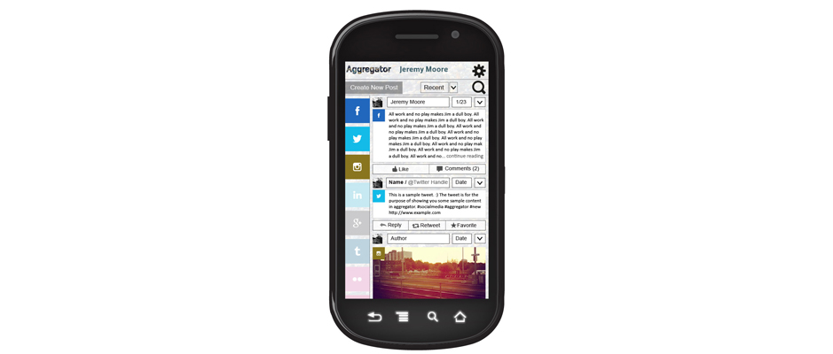
This was a social media app group project meant to aggregate different feeds, aptly named Aggregator. The fundamental aspect was to have one way to view Twitter, Instagram and Facebook content.
There were two tasks that the user had to be able to accomplish: filtering their feed so that only Twitter appeared and retweeting a tweet. The approach that my group took was to have the filtering ability up front and accessible as opposed to a user preference feature.
One UI lesson I learned from working on this project was how much people have gotten use to the conventions on the sites they currently use. Originally the plan was for every post, regardless of network, to have an action tab that would have all the actions (like, retweet, reply, etc). This unifying element proved to be divisive among the users that tested the paper prototypes. Users preferred to have the familiar layout for each social network’s post.


