
After reading The Elements of User Experience by Jesse James Garrett, I began thinking beyond the web world that I am now studying and towards items in the physical that frustrate me. The mention of the classic “coffee pot was not turned on” conundrum that has frustrated humankind for decades rang true for me as well recently. I used to have a simple drip coffee maker that was fairly easy to use. There were one of two functions: brew immediately, or set a delay time for brewing.
I never had any difficulty using this machine for three reasons:
-
Few buttons to keep track of
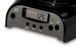
The number of buttons to keep track of was manageable:
- Delay brew to engage that mode
- Set delay to begin setting the time for when Delay brew should start
- Hour and Minute button
- ON and OFF button
-
Buttons were labeled and layout was logical
- I never had to guess a button’s function
- No iconography to decipher
- Immediate brew and delay brew were controlled by buttons on opposite sites of control panel
- There were separate ON and OFF buttons
-
Multiple feedback locations
- Dedicated light for showing power to machine (green light)
- Dedicated light in LED panel to indicate delay brew
Every button on the machine had a dedicated function and the panel flowed well. The primary controls were located at either end, higher than the time controls, establishing a clear hierarchy. There were actually two buttons for on: a dedicated ON power button, and the delay brew button which turned the machine at a designated time. This differentiation was helpful, I thought, since it separated the “I want coffee now” and “I can coffee later” desires of the user.
The machine was constantly at the ready as long as it was plugged into the wall outlet. There was no separate BREW button that had to be pressed after the ON button; the ON button served as the BREW button on my machine, which made sense since IT WAS A COFFEE MACHINE. Why would someone turn on a coffee machine if they didn’t want coffee?
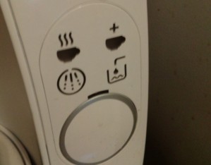
I had the pleasure of trying to operate a new single serve coffee machine and immediately found myself baffled. The following is the control panel:

I had absolutely no idea what was supposed to happen when I first saw this control panel. The main problem was that THERE WAS NO TEXT. I greatly admire simplicity in iconography, but images need to have relevance to the user. A stick figure pushing a mop says cleaning to me, but can you guess which icon means cleaning on this control panel?
The buttons
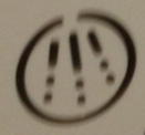
Auto
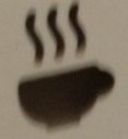
This button means the coffee maker is in automatic mode. It does have some wavy lines to indicate heat coming off of coffee, but this is an end state. What I would have preferred was an icon that looked like coffee was pouring into the mug.
Manual
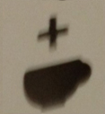
This indicator means the machine’s manual mode had been engaged, which allowed the user to override the auto process and adjust the flavor to their liking. The ‘+’ symbol gave this icon a little more context.
Fill water
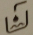
This was the easiest icon for me to decipher, the “water level low” indicator. The primitive faucet shape, container outline and characteristic drop plus wavy lines make this icon very rich in character.
Cleaning
This icon apparently means “descaling” is needed. That’s what it says in the manual, which just adds an unnecessary layer to my understanding. If the manual just said “cleaning” I would get the meaning right away. Product designers should avoid unnecessary jargon whenever they can, whether it be on the machine or in the literature. I probably would have been better off NOT looking at the manual.
My biggest problem with the control panel is that there is only one button without any text or an icon of any kind. The power switch turns the machine on, but then the START/STOP button has to be pressed to begin the brewing process. The signal that the brewing process is ready to begin is the wavy coffee cup turning green. When I first tried using the machine I instinctively tried pressing the START/STOP button immediately before the machine was ready (after the disc containing the coffee is loaded, the machine must read a label using a barcode scanner and prepare itself).
My Plan
I found it quite ironic that a single serve coffee machine with no delay, arguably simpler than my old drip machine at first glance, required a lot more effort to decipher when it came to operation. I would have done the following things to make this interface more intuitive:
- Place a light in the middle of the START/STOP button or perhaps make a lighted ring around the START/STOP button. Even changing the stand by light above the START/STOP button so it glows green when the machine is ready would be helpful. Many users, including myself, would likely be less inclined to try pressing a button that is red.
- Subdivide the icons with some additional iconography to indicate COFFEE and MAINTENANCE. COFFEE could be represented by a coffee icon like it is now, and MAINTENANCE could be indicated by a wrench or similar item.
- Eliminate the FILL WATER icon entirely. The only reason I can see for including this icon is that the tank is on the back of the machine and the product designers figured it would be a better UX if someone didn’t have to actually turn the machine or look to see that the water needed replenishment.
- Instead of having the START/STOP button initiate the manual dispensing process that adjusts the strength of the coffee, add a ‘+‘ button that lights up only when the manual option is available, which happens right now after a certain amount of time has passed
The “one-button” design goal is admirable, but the START/STOP button is doing at least three things here: START, STOP, and INITIATE MANUAL MODE. This is “button overload” in my opinion, a consequence of dictating the UI of the machine according to aesthetic considerations rather than functional ones. I would have included sufficient buttons to provide a solid UX before addressing aesthetic concerns.
If manual control of beverage strength was desired, allowing the user to specify this and store it would have been a good way to preserve the “one button” design. There would be other buttons, but the “one button” becomes the button that MAKES THING HAPPEN instead of the ONLY BUTTON on the machine.