Computer screen with Gulp file

Changing the React-ion

After completing a React build using Webpack, I wanted to get back to the build system I had first used when I began web development, Gulp. My previous experience with Gulp was limited to minification and LESS compilation, two relatively straightforward processes. I quickly realized that creating a React build would require much more development as I needed to package a framework with all of the necessary dependencies

Outline

Decision to switch to Gulp
Basic Babel
Addressing the incomplete bundle
Keeping a watch-ify
gulp-watch vs. watchify
Mapping LESS and Javascript correctly
Conclusion

Decision to switch to Gulp

I found the declarative nature of Webpack appealing to the non-architecture developer that needs a build system without having to manually layout the entire process. However, in order to expand my knowledge I decided that proceeding with a Webpack build was insufficient. I decided to embark on switching my build system over to Gulp so I would have a balanced perspective on the pros and cons of each.

Basic Babel

My initial experience with Webpack started with researching how to compile ES6 code for compatibility with older browsers. I had heard of Babel before and used the instructions there as the launching point for my previous Webpack build. My plan for Gulp was starting with the Babel instructions and proceeding from there. This is where the difference between Webpack and Gulp became readily apparent. With Webpack I didn’t need to specify anything other than the entry point to my app in the loader, and a fully compiled package was outputted. With Gulp I realized that transforming ES6 into older code was only part of the equation.

Addressing the incomplete bundle

Seeking a system that would get me a complete Javascript bundle for the browser, I did searches on ReactJS builds. A lot of the results pointed to Webpack builds, but then I came across references to Browserify. I used RequireJS in combination with Backbone for creating structured Javascript applications; all the files remained where they were, however, and there was no build wth a resulting bundle. In the interest of reducing network calls, I wanted a system to package all my dependencies into a bundle so I investigated how to use Browserify to acheive this. The learning curve proved to be much steeper than Webpack but after reading about how to employ the Browserify Gulp module I learned about using transform(). This way I could package all my dependencies and then apply Babel using a Gulp plugin to create packaged and backwards-compliant Javascript.

var bundler = browserify({entries: [‘app/index.jsx’], debug: true}).transform(babelify);

Keeping a watch-ify

After completing my initial Browserify build the next step was finding a watch system for file changes. I had used gulp-watch for LESS projects, but a companion module to Browserify called Watchify. The implementation was different from gulp-watch in that the Browserify call is passed to Watchify, as opposed to the typical Gulp flow that I’ve implemented before: piping data from one call to another. Instead of a pipe() I was surprised to see a call resembling a jQuery event listener .on() declaration. Overall, Watchify reminded me of Webpack’s build system a bit in that the actual mechanics are somewhat obfuscated.

gulp.task(‘watchify’, function () {
    var args = merge(watchify.args, { debug: true })
    var bundler = watchify(browserify(‘app/index.jsx’, args)).transform(babelify)
    bundle_js(bundler)
    bundler.on(‘update’, function () {
        bundle_js(bundler)
    })
})

gulp-watch vs. watchify

Having Watchify take care of monitoring the build source and triggered a new Browserify bundle was all well and good, but I disliked the number of requirements I was introducing into my application at this point. I decided to switch to a standard gulp-watch for the sake of simplicity. Diving into the pros and cons of Watchify vs gulp-watch, I would sum up my takeaway as a matter of efficiency versus simplicity. With Watchify there is a focus on only loading what has changed and building incrementally; Gulp watch is focused on simply looking for file changes and then executing the same build process over and over again.

Mapping LESS and Javascript correctly

While my LESS and Javascript compilation process had produced properly bundled JS and CSS files, I found that when I tried debugging my styles the LESS files in the browser were empty despite having used the gulp-less-sourcemaps plugin to compile my LESS. It then occurred to me that I have used gulp-sourcemaps in conjunction with the Browserify DEBUG mode to compile my JSX. Reading into the mechanism by which gulp-sourcemaps operated I discovered that I could also use it for mapping my CSS to the original LESS files. I therefore ditched gulp-less-sourcemaps in favour of the the aforementioned general mapping plugin combined with gulp-less. While I added more top level dependencies into my gulpfile, the end result is the same.


Before

gulp.task(‘compile-less’, function () {
     gulp.src(‘app/styles/app.less’)
          .pipe(less({
          sourceMap: {
               sourceMapRootpath: ” // Optional absolute or relative path to your LESS files
               }
          }))
          .pipe(gulp.dest(“dist/styles”));
});

After

gulp.task(‘compile-less’, function () {
     gulp.src(‘app/styles/app.less’)
          .pipe(sourcemaps.init())
          .pipe(less())
          .pipe(sourcemaps.write(“.”))
          .pipe(gulp.dest(“dist/styles”));
});

Conclusion

Compared to Webpack, Gulp was a much more down and dirty way of setting up a React build. The task of assembling all the different gulp modules made it much more challenging than Webpack’s declarative based configuration. Personally, I can understand why a lot of the top results for React builds used Webpack instead of Gulp. Ultimately the choice of build system will of course depend on what people use in their organizations or what people they are collaborating with are using.

 

Computer screen with code snippet

Initiating my own React-ion

Diving into ReactJS, I began with a recommendation to check out a course by Wes Bos. After doing the tutorials, I decided to take a different approach to prototyping than the one I took when I first developed with MeteorJS. My Meteor experience involved taking a tutorial I had done and using that as a launching pad for a Twitter parser. In the following post I describe the highlights of how I got a React build working from scratch based on the documentation. At the end of some sections I have provided a link to the Github branch so you can see the state of the code at that point.

Outline

Babel and Webpack
Source Map
Watching files
Serving content
Modularize code
Adding input
Styling
CSS on it’s own
LESS source maps
Conclusion

Babel and Webpack

This time around I decided to build a project from the ground up including my own choice of build system. I had used Gulp in previous projects for basic tasks such as JS and CSS minification as well as LESS compilation. Hearing about people using Webpack on other projects, I decided to look into using this system especially since I would be using Babel to convert my JSX and ES6 code.

The first difference I noticed when constructing a Webpack config compared to Gulp was the setting oriented nature of the file. With Gulp I was accustomed to specifying a chain of commands for a task, but with Webpack the workflow felt more “object based” than “function based”. This is a preliminary observation based on a basic setup, of course, but made Webpack distinctive to me nonetheless.

Code here

Source map

I have never used source maps as part of my development work before I started coding with React framework. The main reasons were A) wasn’t aware of their purpose before and B) had no need for them even if I had been aware. Most of my Javascript work before had been with frameworks and MVC libraries like Backbone and VueJS. These all involved compilation and package management to various degrees but left the code fundamentally unaltered from the source files.

I quickly realized that tracing bugs in React compiled code back to the original JSX files would be cumbersome. This is when the concept of the source map came to my attention. It was surprisingly easy to add source map creation in Webpack with just one command:

devtool: ‘source-map’

Watching files

My next challenge was figuring out how to speed up the development process so that I would not have to invoke the Webpack build process using the command line every time I made a file change. With Gulp I was familiar with the concept of watchers that trigger Gulp tasks whenever file changes are made. Given Webpack’s settings approach I came back to the command line and introduced myself to the watch functionality.

webpack –watch

Serving content 

The method above worked well for compiling the static JS, but the matter of serving the files still remained. For simple projects I generally use the basic Python http server.

python -m SimpleHTTPServer 8080

The Webpack dev server, on the other hand, appealed to me since I could take care of compiling, serving content, and refreshing the browser in one package.

Code here

Modularize code

Based on my previous framework experience, I decided to split my code up into separate files right away. This was another case where the difference between Webpack and Gulp became apparent. With Gulp I was accustomed to specifying a catch all path to scoop up all the files in a directory for processing. With Webpack, on the other hand, I found that additional configuration was unnecessary; the imports were all picked up automatically by the compiler.

Code here

Adding input

After splitting my code into modules, I decided the next step would be connecting input to output. In order to accomplish this I created a new module for form inputs and made a TextInput component. I placed a callback in my project base and passed it into the TextInput component. This allowed me to change the application state from the TextInput module and automatically display the latest data on my app’s homepage.

updateUserName(name){
    this.setState({“user”: name.target.value});
}
<input type=”text” onChange={this.updateUserName}/>

Styling

After getting a basic site structure built, it was time to learn how to set up the styling system. I have used a lot of different CSS processors and LESS is still my favourite one. Configuring LESS in Webpack proved to be more complex than Gulp, however. This was one of the cases where I needed to fall back on the documentation extensively.

The first step was getting styles to show up on the page using the simplest method possible. I used the Webpack less-loader to accomplish this.

{
    test: /\.less$/,
    loader: “style!css!less”
}

The downside of this approach is that it bundles the LESS as CSS code inside of the Javascript instead of a separate stylesheet. For my next step I aimed to place my generated CSS outside of the bundled JS to allow for source mapping of the CSS to the original LESS.

Code here

CSS on it’s own

To get the CSS into it’s own file, I was introduced to the concept of extracting data from the bundle. I eventually settled on using the ExtractTextPlugin.

loader:ExtractTextPlugin.extract(“style-loader”,”css-loader!less-loader”),

This step seemed somewhat counterintuitive to me, since Webpack is bundling all of the code only to have some of it extracted for styling purposes. With Gulp I was accustomed to have different processes for handling JS and CSS tasks.

Code here

LESS source maps

When I first started using LESS I wanted to incorporate Bootstrap as I had done with plain CSS styled sites. This is when I first encountered the issue of debugging compiled styles. Searching for declarations or comments in the compiled css and then trying to find them in the LESS files could get quite tedious. As started previously, source maps came to my attention when working with Javascript, but I started to wonder if they were possible with other files.

As I’ve come to except from Webpack, adding source map support was simply a matter of adding a setting to the loader specification: sourcemap.

{
    test: /\.less$/,
    exclude: /node_modules/,
    loader: ExtractTextPlugin.extract(“style-loader?sourceMap”, “css-loader? sourceMap!autoprefixer? browsers=last 5 version!less-loader?sourceMap”),
},

The one downside that I’ve countered so far is that CSS to LESS mappings appear to be specific only to the top-most selector, which means I could have a selector 100 lines down in the LESS while the mapping points to the parent selector on line 3. This is only my first observation of mappings of course, which I know from using JSX -> JS can vary in precision.

Code here

Conclusion 

After having used Gulp to automate simple build processes and Webpack for React JS, my opinion is that while Gulp may require more skill when it comes to crafting the build process with all the methods involved it is still easier for me to understand. Webpack processes, on the other hand, felt more obfuscated behind the declarative nature of the configuration.

For my next experiment I want to switch my build system over to a Gulp process while maintaining my current compiled output (JS and CSS).

Canvas 3D

Canvas 3D Tutorial

Building on my experience with threeJS and simple simulations, I decided to do a tutorial on Canvas 3D using threeJS and webGL as a demonstration of new web technologies. The basic star field simulations I had completed before had given me a general understanding of the procedure for creating objects in Canvas 3D, and I decided to work with the other primitives as well as do basic physics. I decided that the deliverable would be a basic foundation for the Crazy Leap Pong game that I developed. It would serve as an ideal introduction to integrating threeJS, leapJS (for LEAP motion controller) and Node.JS.

The Crazy Leap Pong article addresses the programming that began with the scene created by the tutorial. This article aims to address the creation of the tutorial itself.

Outline

Tutorial: First Steps
Scripting
Silverback: Recording the Action
Editing
Presentation
Video
Github

Tutorial: First Steps

One of the first things I realized when creating the tutorial was that it was best to have a working prototype of the technology I wanted to demonstrate before I began recording. One of the worst things that can happen to any live demo is to have the end result fail (sometimes spectacularly). The same goes for a recorded demo; it would be an unnecessary loss of time to record a demo and then have the final threeJS simulation fail to perform according to expectations. I decided that the demo must work flawlessly before any recording could be done, and this was accomplished with little to no problems

Scripting

My initial tests with recording the tutorial demonstrated the need for me to have a script prepared beforehand. Attempting to do the demo in real time resulting in a lot of stumbling that would complicate the editing of the final product. Since I had already completed the code that would be presented during the tutorial, I decided that preparing all of my instructions and comments about the code would be prudent. The code was broken down into small pieces that I could record as inpidual segments which would then be edited together to make the final tutorial.


Silverback: Recording the Action

For screen recording, I decided to use an application for Mac OS X called Silverback. It is intended for user experience testing, capturing both the screen and the camera image. It does allow the export of footage without the user camera capture, which made it suitable for documenting the tutorial. One feature that I found beneficial was the mouse click point highlighting which helped keep track of actions of the screen during the presentation.

Editing

Given that my target length for the tutorial was approximately 10 minutes, it was inevitable that there was going to have to be a fair amount of footage needing to be cut after I finished recording. I ended up with 14 segments of footage in total with almost 12 minutes of length. Carefully reviewing my audio, I eliminated any unnecessarily long gaps in speech and anything else that would not adversely impact the understanding of the tutorial.

Presentation

Given that the text in the tutorial would have to be legible, it was necessary to encode at a fairly high bit rate and at a sufficient size. Uploading to Youtube, I ensured that the tutorial would have the option of being presented at 720p and full screen. In the near future, I would like to add captions to the video which will require examining the script and all the remarks in the video where the script was not followed word for word.

Tutorial Video

The tutorial is featured below and can be found on Youtube using this link

Github

The Github repository with the latest version of this project can be found here.

Who Wants to Play?

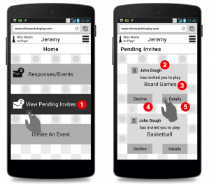
This project involved the creation of a social media app for collaborative event creation. The idea would be for one person to create an event defined by an activity, and then invite friends who would then vote on where to have the event. I chose to focus on playing games as an activity, with the poll being dedicated to finding a venue. One feature that I decided to implement in order to take some of the workload off the event organizer was to implement some logic to the friend selection process. Using a combination of a list created by the user and content from social media (Facebook for now), the app would find people most likely to participate in a given activity based on factors such as event attendance and stated interests. These friends would appear at the top of the invite lists as people who would most enjoy a particular game.

Making coffee is not a Bosch

After reading The Elements of User Experience by Jesse James Garrett, I began thinking beyond the web world that I am now studying and towards items in the physical that frustrate me. The mention of the classic “coffee pot was not turned on” conundrum that has frustrated humankind for decades rang true for me as well recently. I used to have a simple drip coffee maker that was fairly easy to use. There were one of two functions: brew immediately, or set a delay time for brewing.

I never had any difficulty using this machine for three reasons:

  • Few buttons to keep track of

simpleCoffee
The number of buttons to keep track of was manageable:

  • Delay brew to engage that mode
  • Set delay to begin setting the time for when Delay brew should start
  • Hour and Minute button
  • ON and OFF button
  • Buttons were labeled and layout was logical

  • I never had to guess a button’s function
  • No iconography to decipher
  • Immediate brew and delay brew were controlled by buttons on opposite sites of control panel
  • There were separate ON and OFF buttons
  • Multiple feedback locations

  • Dedicated light for showing power to machine (green light)
  • Dedicated light in LED panel to indicate delay brew

Every button on the machine had a dedicated function and the panel flowed well. The primary controls were located at either end, higher than the time controls, establishing a clear hierarchy. There were actually two buttons for on: a dedicated ON power button, and the delay brew button which turned the machine at a designated time. This differentiation was helpful, I thought, since it separated the “I want coffee now” and “I can coffee later” desires of the user.

The machine was constantly at the ready as long as it was plugged into the wall outlet. There was no separate BREW button that had to be pressed after the ON button; the ON button served as the BREW button on my machine, which made sense since IT WAS A COFFEE MACHINE. Why would someone turn on a coffee machine if they didn’t want coffee?

I had the pleasure of trying to operate a new single serve coffee machine and immediately found myself baffled. The following is the control panel:

single serve control

I had absolutely no idea what was supposed to happen when I first saw this control panel. The main problem was that THERE WAS NO TEXT. I greatly admire simplicity in iconography, but images need to have relevance to the user. A stick figure pushing a mop says cleaning to me, but can you guess which icon means cleaning on this control panel?

The buttons

Auto

auto coffee

This button means the coffee maker is in automatic mode. It does have some wavy lines to indicate heat coming off of coffee, but this is an end state. What I would have preferred was an icon that looked like coffee was pouring into the mug.

Manual

manual coffee

This indicator means the machine’s manual mode had been engaged, which allowed the user to override the auto process and adjust the flavor to their liking. The ‘+’ symbol gave this icon a little more context.

Fill water

add water coffee

This was the easiest icon for me to decipher, the “water level low” indicator. The primitive faucet shape, container outline and characteristic drop plus wavy lines make this icon very rich in character.

Cleaning

clean coffee

This icon apparently means “descaling” is needed. That’s what it says in the manual, which just adds an unnecessary layer to my understanding. If the manual just said “cleaning” I would get the meaning right away. Product designers should avoid unnecessary jargon whenever they can, whether it be on the machine or in the literature. I probably would have been better off NOT looking at the manual.

My biggest problem with the control panel is that there is only one button without any text or an icon of any kind. The power switch turns the machine on, but then the START/STOP button has to be pressed to begin the brewing process. The signal that the brewing process is ready to begin is the wavy coffee cup turning green. When I first tried using the machine I instinctively tried pressing the START/STOP button immediately before the machine was ready (after the disc containing the coffee is loaded, the machine must read a label using a barcode scanner and prepare itself).

My Plan

I found it quite ironic that a single serve coffee machine with no delay, arguably simpler than my old drip machine at first glance, required a lot more effort to decipher when it came to operation. I would have done the following things to make this interface more intuitive:

  • Place a light in the middle of the START/STOP button or perhaps make a lighted ring around the START/STOP button. Even changing the stand by light above the START/STOP button so it glows green when the machine is ready would be helpful. Many users, including myself, would likely be less inclined to try pressing a button that is red.
  • Subdivide the icons with some additional iconography to indicate COFFEE and MAINTENANCE. COFFEE could be represented by a coffee icon like it is now, and MAINTENANCE could be indicated by a wrench or similar item.
  • Eliminate the FILL WATER icon entirely. The only reason I can see for including this icon is that the tank is on the back of the machine and the product designers figured it would be a better UX if someone didn’t have to actually turn the machine or look to see that the water needed replenishment.
  • Instead of having the START/STOP button initiate the manual dispensing process that adjusts the strength of the coffee, add a ‘+‘ button that lights up only when the manual option is available, which happens right now after a certain amount of time has passed

The “one-button” design goal is admirable, but the START/STOP button is doing at least three things here: START, STOP, and INITIATE MANUAL MODE. This is “button overload” in my opinion, a consequence of dictating the UI of the machine according to aesthetic considerations rather than functional ones. I would have included sufficient buttons to provide a solid UX before addressing aesthetic concerns.

If manual control of beverage strength was desired, allowing the user to specify this and store it would have been a good way to preserve the “one button” design. There would be other buttons, but the “one button” becomes the button that MAKES THING HAPPEN instead of the ONLY BUTTON on the machine.