Crazy Traffic Warden

The final project for interactive coding was a project in Flash using Actionscript 3. I decided to use my Arduino flash interface that I had already built for my Color Response game, with the on screen buttons taking the place of the physical board. Since there is no physical interface the on screen buttons do double duty as an indicator and an input method. My program randomly creates a light pattern and manipulates the buttons, which the human player has to replicate.

Since I had already settled on a green-yellow-red light combination, I decided to run with the concept of a traffic light. The basic story is that the traffic warden has gone crazy, taken control of the traffic light and decided to create unpredictable patterns. If the user successfully repeats the pattern, the traffic warden will allow traffic to proceed north.

Using Adobe Illustrator, I created a 2.5D representation of a traffic intersection (gaining some valuable Illustrator experience with perspective grids). The next step was creating the east/west traffic cycle, which is animated on a simple ENTER FRAME event resulting in the vehicles moving a certain number of pixels based on a random speed variable. One of four vehicles is randomly selected every time a new vehicle needs to be added to the scene. I also created a simple pedestrian cycle to add to the street life (the figures do not have any character animation currently). The pedestrians will walk normally unless the northbound light is green, at which point they will walk until the curb where they will stop; if they are in the intersection, they will hurry out of the way and resume their normal pace once they are safe.

The traffic signals in the scene are fully responsive and change with the conditions.

Click below to play Crazy Traffic Warden

Play Crazy Traffic Warden

Arduino Color Memory Game

Origin of Idea

The initial idea for the Crazy Traffic Warden color memory game grew out of my desire to have an interactive game involving patterns and cognition. While sound sensors and microphones could use human activity as sources for generating patterns on screen, a program based on direct human input appealed to me. The simple test program for Arduino is a blinking LED, and I decided to take the idea of the simple light and add an element of creativity.

The Basic Program

The basic challenge was linking a visual interface in Flash to the Arduino using AS3 Glue and a proxy server. Once the proxy server connection was running, I could create a simple program with one button controlling one LED on the screen. This introduced me to the basics involving writing and reading pin values on the Arduino, and linking a pin to a particular action, in my case a click on a stage object.
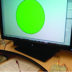
Initial click test

The code was a simple cycle where clicking on the circle changed its alpha to full and turned the light on. The cycle continued by adding a listener for a second click which would turn the light off and the alpha down low. Flash would then listen for a click to start the whole cycle over again.

Getting Arduino to work with Mac

Setting up the Arduino with the Mac was the first major stumbling block in working on the game. Mac OS X does not use the COM port convention of the PC, instead using verbose names for all of the connections that the computer can use to communicate. I encountered the following problems:

* had to determine the correct serial port
* wrong connection speed selected; initially selected 9600 bps when I was supposed to be using 57600 bps
* wrong configuration file used; initially forgot to rename the config file to include the osx extension
* Serpoxy program couldn’t find configuration file without the proper extension

Once I got past these barriers I was able to move on to the next step: three light control

The buttons

Working with three lights originally involved duplicating the single green button code three times and adding event listeners for activating and deactivating on all three buttons, resulting in a total of six programs. Realizing how much unnecessary code this involved I reformulated and made the targeted object whatever I had clicked on. This allowed me to use the same on/off code for all three lights.
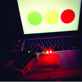
Three light test

Getting in Touch with Touch Sensors

After I got the lights on respond to the computer control, the next step was getting the lights to respond to the second player using touch sensors. This would allow human input on the Arduino end of the game. The test of coordination would be one player having to repeat the color pattern they had received by tapping on panels of acyclic with a light underneath.

The first step involved using the AS3 Glue monitor to see what the feedback from the touch sensor looked like. Once I had this information I could begin developing the programs to activate the lights with sensor input.

Setting up Touch Sensors

Using the initial AS3 Glue program I quickly figured out that in order to get useful data, analog sensors had to be continuously read so as to not miss any inputs. The standard glue program had the natural background noise read by the analog pins on the Arduino sampled 20 times a second.

This frequency would produce a lot of unreliable results if someone pressed a sensor for too long. If Player Two produced unwanted sensor data, comparing their presses to the computer player presses would yield an error since there would be a capture mismatch. I therefore set the frequency lower to 6-10 times per second. Subsequent user testing convinced me to revise this value yet again and provide a way to adjust for different users (since some people hold down longer than others or need to apply force over a longer period).

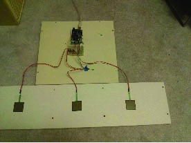
Finished Touch Sensors

When the light activation program was first written, a light would turn on when the corresponding touch sensor was pressed. A LED OFFprogram was written and called for, but it would not turn the lights off. It was then that I realized that timers needed to be used. A timer would begin when the touch sensor was pressed, and upon its completion the LED OFF program would run. This program would also be tied to the Player 1 (Computer User) clicking programs; this way the light would turn on for the same duration regardless of input (in theory).

User Testing

Once the touch sensors were successfully linked to the LEDs and the results recorded, the issue of tolerance and time remained. Too little time for collecting touch sensor input would cause Player Two to fail; setting the threshold or sample interval too low for the touch sensors would create a lot of undesired reads.

The basic AS3 Glue program sampled the analog pins 20 times per second. In order to adjust to a user pressing sensors, a variable was created that would control how often the touch sensors would be sampled; I eventually settled on 300 ms, or about 3.3 times per second, for the sample interval.

The total collection time was based off the sample interval and the number of clicks by Player One. This way the collection time would change depending on how long the sequence would be.

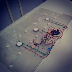
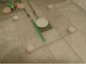
Touch Sensor with acrylic

Program Logic

Once all the data was captured and lights working properly, the final element was actually running the comparison program to determine the score and if Player Two won.

There were a couple of challenges that I had to overcome in terms of the scoring logic:

-If the comparison program only ran for the length of the touch pad data array, Player Two could win even if they did not complete the number of lights Player One activated. If Player Two pressed three lights but the sequence was four, they would win because the comparison program would only check the first three entries in Player One’s array.

-If the comparison program ran for the length of the Player 1 (computer) array, Player Two could tap a touch sensor one time too many and that wouldn’t count against them.

The solution was to first check to see if either condition existed, and then automatically fail Player Two. If they did not do enough presses or did too many, they would lose. If either of these conditions wasn’t satisfied, then the comparison could begin since Player Two did the same number of presses that they received.

Future Things I Want To Do

-Build the game as independent touch pad units that can plug into the Arduino

-Build the entire game in an enclosure with easy plug-in-play connections for the units

-Add a way to filter our errors in the touch sensors (if someone holds for too long, eliminate readings except the first one)

-Add a calibration program that takes 10-20 presses and determines the average pressure

Making coffee is not a Bosch

After reading The Elements of User Experience by Jesse James Garrett, I began thinking beyond the web world that I am now studying and towards items in the physical that frustrate me. The mention of the classic “coffee pot was not turned on” conundrum that has frustrated humankind for decades rang true for me as well recently. I used to have a simple drip coffee maker that was fairly easy to use. There were one of two functions: brew immediately, or set a delay time for brewing.

I never had any difficulty using this machine for three reasons:

  • Few buttons to keep track of

simpleCoffee
The number of buttons to keep track of was manageable:

  • Delay brew to engage that mode
  • Set delay to begin setting the time for when Delay brew should start
  • Hour and Minute button
  • ON and OFF button
  • Buttons were labeled and layout was logical

  • I never had to guess a button’s function
  • No iconography to decipher
  • Immediate brew and delay brew were controlled by buttons on opposite sites of control panel
  • There were separate ON and OFF buttons
  • Multiple feedback locations

  • Dedicated light for showing power to machine (green light)
  • Dedicated light in LED panel to indicate delay brew

Every button on the machine had a dedicated function and the panel flowed well. The primary controls were located at either end, higher than the time controls, establishing a clear hierarchy. There were actually two buttons for on: a dedicated ON power button, and the delay brew button which turned the machine at a designated time. This differentiation was helpful, I thought, since it separated the “I want coffee now” and “I can coffee later” desires of the user.

The machine was constantly at the ready as long as it was plugged into the wall outlet. There was no separate BREW button that had to be pressed after the ON button; the ON button served as the BREW button on my machine, which made sense since IT WAS A COFFEE MACHINE. Why would someone turn on a coffee machine if they didn’t want coffee?

I had the pleasure of trying to operate a new single serve coffee machine and immediately found myself baffled. The following is the control panel:

single serve control

I had absolutely no idea what was supposed to happen when I first saw this control panel. The main problem was that THERE WAS NO TEXT. I greatly admire simplicity in iconography, but images need to have relevance to the user. A stick figure pushing a mop says cleaning to me, but can you guess which icon means cleaning on this control panel?

The buttons

Auto

auto coffee

This button means the coffee maker is in automatic mode. It does have some wavy lines to indicate heat coming off of coffee, but this is an end state. What I would have preferred was an icon that looked like coffee was pouring into the mug.

Manual

manual coffee

This indicator means the machine’s manual mode had been engaged, which allowed the user to override the auto process and adjust the flavor to their liking. The ‘+’ symbol gave this icon a little more context.

Fill water

add water coffee

This was the easiest icon for me to decipher, the “water level low” indicator. The primitive faucet shape, container outline and characteristic drop plus wavy lines make this icon very rich in character.

Cleaning

clean coffee

This icon apparently means “descaling” is needed. That’s what it says in the manual, which just adds an unnecessary layer to my understanding. If the manual just said “cleaning” I would get the meaning right away. Product designers should avoid unnecessary jargon whenever they can, whether it be on the machine or in the literature. I probably would have been better off NOT looking at the manual.

My biggest problem with the control panel is that there is only one button without any text or an icon of any kind. The power switch turns the machine on, but then the START/STOP button has to be pressed to begin the brewing process. The signal that the brewing process is ready to begin is the wavy coffee cup turning green. When I first tried using the machine I instinctively tried pressing the START/STOP button immediately before the machine was ready (after the disc containing the coffee is loaded, the machine must read a label using a barcode scanner and prepare itself).

My Plan

I found it quite ironic that a single serve coffee machine with no delay, arguably simpler than my old drip machine at first glance, required a lot more effort to decipher when it came to operation. I would have done the following things to make this interface more intuitive:

  • Place a light in the middle of the START/STOP button or perhaps make a lighted ring around the START/STOP button. Even changing the stand by light above the START/STOP button so it glows green when the machine is ready would be helpful. Many users, including myself, would likely be less inclined to try pressing a button that is red.
  • Subdivide the icons with some additional iconography to indicate COFFEE and MAINTENANCE. COFFEE could be represented by a coffee icon like it is now, and MAINTENANCE could be indicated by a wrench or similar item.
  • Eliminate the FILL WATER icon entirely. The only reason I can see for including this icon is that the tank is on the back of the machine and the product designers figured it would be a better UX if someone didn’t have to actually turn the machine or look to see that the water needed replenishment.
  • Instead of having the START/STOP button initiate the manual dispensing process that adjusts the strength of the coffee, add a ‘+‘ button that lights up only when the manual option is available, which happens right now after a certain amount of time has passed

The “one-button” design goal is admirable, but the START/STOP button is doing at least three things here: START, STOP, and INITIATE MANUAL MODE. This is “button overload” in my opinion, a consequence of dictating the UI of the machine according to aesthetic considerations rather than functional ones. I would have included sufficient buttons to provide a solid UX before addressing aesthetic concerns.

If manual control of beverage strength was desired, allowing the user to specify this and store it would have been a good way to preserve the “one button” design. There would be other buttons, but the “one button” becomes the button that MAKES THING HAPPEN instead of the ONLY BUTTON on the machine.

Grocery List

Learned essential jQuery and decided to improve a list exercise by writing a shopping list creator. After entering the quantity and type of item you are planning to get, you click on ADD to create the list. You can also remove an item by clicking on it. This list is fairly dumb in that it can’t discern the type of data entered into the fields right now. The next step will be to add a function to check that quantity is a number and not a string, returning an error message if the user does not input a quantity or a quantity that appears to be too high and thus an error. The ability to specify if a quantity is meant to represent number or weight is also another jQuery function I intend to learn.

No Argonauts for this JSON

Reached a point where the number of posts on my twitter photo blog was becoming hard to manage, I decided I needed to figure out a way to organize my work efficiently. Having almost 800 photos in my flickr stream meant that creating a database manually by copying names was going to be time consuming. Knowing that Flickr and programmers had surely taken care of this obstacle, I decided to investigate the flickr API and found a list of photos by photoset method.

Using the data generated by this method was a challenge at first. I initially tried to use the XML output but struggled to create a usable list. I then decided to use the JSON output, which until this project I was unfamiliar with. After creating the list I recognized the object and array structure (see below, some values redacted) including the title variable that I wanted.

var ChicagoList =
{
“photo”: [
{ “id”: “7827394778”, “secret”: “——“, “server”: “7249”, “farm”: 8, “title”: “Hilliard Towers”, “isprimary”: 1 },
{ “id”: “7827395476”, “secret”: “——“, “server”: “7107”, “farm”: 8, “title”: “Hilliard Towers 2”, “isprimary”: 0 },
{ “id”: “7898311488”, “secret”: “——“, “server”: “8448”, “farm”: 9, “title”: “Diversey Brown Line”, “isprimary”: 0 },

…..

{ “id”: “7827407022”, “secret”: “——“, “server”: “8296”, “farm”: 9, “title”: “Typical concrete condo Chicago”, “isprimary”: 0 }
]
};

Using one of my old console.log loops for examining data, I created a short program using bracket notation to access each object (photo) in the list array in sequence and its name variable. I then logged the names to the console and copied the list into a spreadsheet.

for (var i = 0 ; i < 170; i ++) { console.log(ChicagoList.photo[i].title); }

This was a quick and dirty method though, but it did the job. I used the “for loop” which ran for longer than the dataset to ensure I didn’t lose anything. A “while” loop would have been cleaner and I had used file analysis loops like that in AutoLISP. Now that I am concluding Javascript review my next step is to move onto jQuery and AJAX so that I can generate my photo lists server side on my website. I could then provide galleries covering each of my cities on single pages so that people could easily browse my collection from my own website, since I am limited to 30 photos per page as per the conditions of using my non-commercial flickr API key. Wish me luck.